
ORIGINAL DRAFT
A lot of visual applications need to draw measurable distances in one form or another. Most of today’s drawing programs support rulers to help the user judge the scale of a drawing. Graphs commonly have a scale associated with them, typically in the form of an X and Y axis. This month we’re going to develop a generic component that helps us address a number of these variants in a single place. We’ll design and implement a JRuler class that supports a loosely-coupled RulerModel interface, letting us define various different types of rulers and axes.
Defining a ruler model includes a number of elements. The model must let us specify the orientation of a ruler (whether the tick marks and labels assume a NORTH, SOUTH, EAST or WEST edge orientation), the precision of our labels (how many decimal places to represent), the offset to start from, the length in units to measure, the increment for each unit, as well as the major tick marks, number of tick divisions, and the number of tick highlights to draw. The resulting component is highly flexible and usable in a number of applications.
To help encourage flexibility, we’ll be using a couple of custom layout managers. The first allows us to draw tick mark and label panels either vertically or horizontally neighboring each other. The other will permit us to draw the labels, spread across the necessary region. The layout manager can be used for other purposes but we’ll assume it lays out JLabel components in this application.
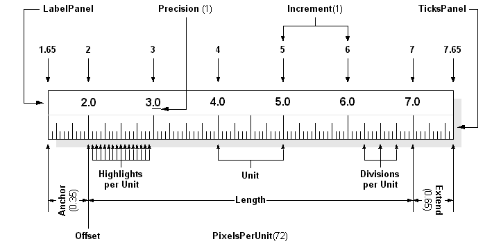
Figure 1: The RulerModel must account for a large number of elements, including: the Offset and Length in units, Anchor and Extend adjustments to the left and right, an increment value for each unit, and precision for drawing labels, as well as the number of divisions per unit and highlights per unit.
Figure 1 shows the major elements we have to deal with. The naming is my own, since I don’t know of any standard that deals with this type of component, though I suspect the ruler industry has its own established nomenclature. Since there are so many elements, we’ll look at them in a table format, describing the purpose of each. The model we use will have to take each of these into account in one way or another, though the interface does not imply a specific approach. Table 1 describes each element, along with the method we’ll use in our interface.
| Diagram | Method | Description |
|---|---|---|
| Orientation | getOrientation | We need to describe the orientation of our ruler on the basis of whether it is vertical and on which side the tick marks and labels go. To do this succinctly, we indicate whether the ruler is placed at the NORTH, SOUTH, EAST or WEST position. |
| Direction | getDirection | The direction of a ruler is typically from left to right or top to bottom, but we may need to reverse this. The direction is therefore described as either FORWARD or BACKWARD. |
| Precision | getPrecision | Labels reflect a given level of precision to the right of a decimal place. This value determines the number of decimal digits to show. |
| Offset | getOffset | The offset position reflects the base value of a ruler. This is the first value at which a label is placed. The ruler is described by this offset position and a length value in units describing the number of units to display, with additional adjustments for the Anchor and Extend to the left and right or top and bottom. |
| Anchor | getAnchor | The Anchor is a decimal value between 0 and 1 that describes, in fractions of a unit, the amount of space to leave at the beginning of the ruler. Tick marks will be drawn in this area but no labels will be included. |
| Extend | getExtend | The Extend is a decimal value between 0 and 1 that describes, in fractions of a unit, the amount of space to leave at the end of the ruler. Tick marks will be drawn in this area but no labels will be included. |
| Length | getLengthInUnits | The length value reflects the number of units to draw from the Offset point. The total length of a ruler in units is this value added to the the Anchor and Extend values (multiplied by the unit size). |
| Increment | getIncrement | The increment is a description of the size of a logical unit. In our figure, this value is 1 but unit values are unconstrained and may be of any size. |
| Pixels/unit | getPixelsPerUnit | This method returns a fixed value or one adjusted for scaling. If the pixelsPerUnit value used in constructing a DefaultRulerModel is negative, the ruler is assumed to be dynamically resizable. A constant (ADJUSTABLE) is provided for this purpose. |
| Divisions/unit | getDivisionsPerUnit | The number of divisions per unit is somewhat arbitrary. A typical metric value is 10, while English inches are typically divided by 8. |
| Highlights/unit | getHighlightsPerUnit | Highlights are common in rulers and, aside from the major unit marks, help make the divisions per unit more readable. Common values are 2 or 4. |
| Fixed | isFixed | If the pixelsPerUnit value is positive, this is true and the ruler will be draw from start to finish using the exact pixel value provided. If a negative value (such as ADJUSTABLE) is used, this method will return false and the ruler will adjust dynamically when it is resized. |
Listing 1 shows the RulerModel interface. As you can see, each of the methods described in Table 1 is included. The interface extends RulerConstants to make it easy to import relevant constants. RulerConstants, in turn, extends SwingConstants and declares boolean values for FORWARD, BACKWARD and an integer value for ADJUSTABLE. When you work with JRuler, you can make your classes implement the RulerConstants interface or qualify the constants with a JRuler prefix (JRuler.ADJUSTABLE, for example), as you see fit.
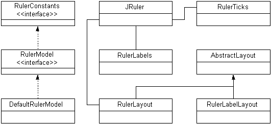
Figure 2: JRuler classes include the RulerConstants and RulerModel interfaces as well as two layout managers to handle JRuler positioning of RulerLabels and RulerTicks. The RulerLabels class uses the RulerLabelLayout to properly position the labels.
Figure 2 shows the relationships between classes in this component. Frequent readers of this column will recognize the AbstractLayout class I always use as the basis for all my layout managers. We’ll list the RulerTicks, RulerLabelLayout and JRuler classes in print. You can find the rest of them online at www.java-pro.com.
RulerTicks is responsible for drawing tick marks for the ruler. The RulerLabelLayout does all the real work behind the RulerLabels class. In fact RulerLabels merely creates the labels using the length value as a counter, starting at the offset value, incrementing by the increment value, and formatting the text based on the precision value. The JRuler class, of course, is the main component class that ties it all together.
Listing 2 shows the RulerTicks class, which extends JPanel and is responsible for drawing tick marks along an axis. There are many things to take into account but they are all derived from the RulerModel representation. The constructor is simple enough, storing a reference to the RulerModel instance. Most of the work takes place in the paintComponent method.
The first thing we do is get a reference to a Graphics2D context so that we can use the 2D API to do our drawing. We store values for many of the RulerModel settings in temporary variables to make sure the code is more readable. We treat vertical and horizontal rulers slightly differently so you’ll see an if/else statement that splits the two behaviors. In each clause, there is a main loop and two inner loops. The main loop walks through the major unit positions, starting one lower than the minimum and one higher than the maximum, so we can account for the anchor and extend areas.
The inner loops draw the division and highlight tick marks. The major tick marks run across the whole tick mark area, the highlights draw across two thirds and the division marks across a third, adjusting based on the ruler model orientation. We also account for backward drawing, which is equivalent to justification at one end or another of the ruler’s drawing area. Forward drawing is either from left to right or top to bottom.
The RulerLableLayout class in Listing 3 shows how we deal with ruler label positioning. The labels are actually created in the RulerLabels panel using a NumberFormat to control the precision to the right of the decimal place. The two RulerLableLayout constructors keeps a reference to the RulerModel and offer the optional ability to define a horizontal and vertical gap between components. We extend the AbstractLayout class so that we only have to implement three methods.
The minimumLayoutSize and preferredLayoutSize methods calculate the total minimum/preferred height or width, depending on the orientation of the ruler, and assume the largest component for the opposing axis value. The real work takes place in the layoutContainer method, which sets a number of readable variables for the RulerModel values we need to account for and walks through each of the components from first to last to lay them out. Taking the orientation and direction into account, we can calculate the position of each label based on its preferred dimensions. We adjust positions for the first and last labels, depending on the drawing direction and the amount of space we have available at the beginning and end of the drawing space.
Listing 4 shows the JRuler class, which ties everything together into a useful component. The constructor assumes a RulerModel instance is passed to it, so we provide a number of get<X>Instance methods to support common requirements. The factory methods are called getMetricInstance, getEnglishInstance, getVariableInstance and getFixedInstance. The first two provide instances of a fixed length English or Metric ruler. The assume a 72 pixel display and tend to be accurate enough for most applications that need to represent inches and centimeters. The fixed and variable methods have more arguments, which map on to the DefaultRulerModel implementation used in this implementation.
If you want to manage the model more directly, creating your own for example, two accessor methods allow you to get and set the model. It’s up to you to call repaint if you want the changes reflected visually. A more robust implementation would respond to ruler model changes dynamically, but I decided not to complicate matters or extend the code base for this article, given the number of variants I was already trying to account for and the limitations of time and publishing space available.
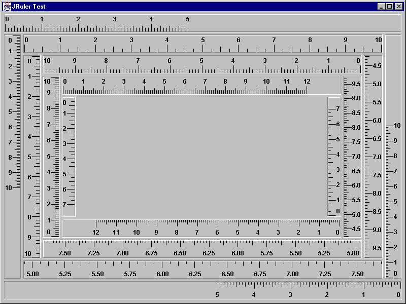
Figure 3: JRulerTest showing fixed and variable rulers, in forward and backward, with varying tick mark and occasional anchor/extend settings.
Figure 3 shows the JRulerTest program. There are many variants demonstrated here but only a few possible combinations are represented. The outside and inside rectangles show fixed rulers, which have a fixed pixel length assigned to each unit. When the window is resized, the end of the ruler will be clipped if it doesn’t fit into the display area. The rest of the rulers are variable and will adjust as you resize the window. Both forward and backward variants are represented, as are rulers with non-zero anchor and extend values. The outside examples show the Metric and English ruler instances, both forward and backward.
The JRuler component is deceivingly simple. Accounting for variables like orientation, direction, various unit sizes, label options and so on, is more challenging that the final product might suggest. I don’t profess to have developed the quintessential model in this component, but alert readers should see a great deal of reusability in this design. In fact, these classes can easily be used in raster and vector drawing programs, as axes in graphs for charting software, in desktop publishing applications, and so on. May the code serve you well.